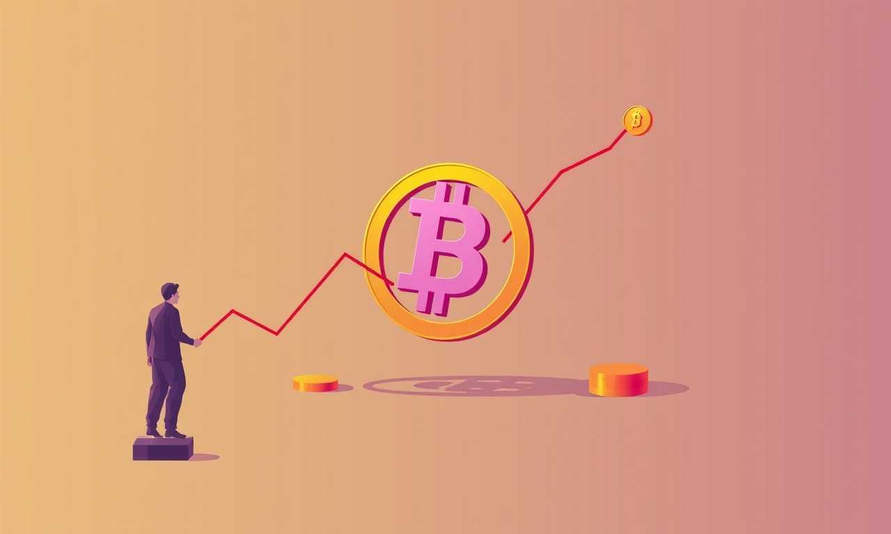
Unpacking Liquidity Dynamics Using On Chain Activity Metrics

I remembered the first time I tried to pull out my earnings from a DeFi pool only to find my balance frozen on the contract for twenty‑four hours. The screen glowed with a warning: “Insufficient liquidity or high slippage.” The panic was real and collective—friends on Discord were shouting about “impermanent loss” and “pool failure.” I was already at the point where my excitement about decentralized finance was turning into an anxiety that felt too much like a casino. That moment is the kind of thing that forces you to go beyond the flashy headlines and dig into the metrics that actually drive these markets.
Let’s zoom out. Liquidity in DeFi is not a single number; it is a living, breathing ecosystem that responds to traders, yield‑farmers, front‑runners, and the miners who provide security. On‑chain data—every transaction, every block, every gas fee—conveniently records this activity. The trick is learning how to read it like a weather map: you can’t predict the storm precisely, but you can anticipate the wind, the barometric pressure, and the likelihood of a rain shower.
Liquidity in DeFi: A Quick Primer
In traditional finance, liquidity is the ease with which you can buy or sell an asset without affecting its price. In DeFi, we have two major flavors:
- Pool Liquidity: the amount of base tokens (ETH, USDC, etc.) locked in an automated market maker (AMM).
- Market Liquidity: the depth of the order book, which does not exist on AMMs but manifests in the pool balance distribution as we talk about slippage.
When a pool’s reserves are unbalanced—say 0.5% of the total pool value is in one asset—withdrawals of that asset trigger steep price moves. This is where slippage comes in: every trade pulls the pool toward the new ratio, and the more volatile the asset, the higher the potential loss for the trader.
On‑Chain Metrics that Capture Liquidity
The most direct indicator is Total Value Locked (TVL). It tells you how much capital a protocol is holding. But TVL alone is a blunt instrument; a protocol could have a high TVL and be completely frozen if its trading pair is illiquid.
1. Transaction Volume and Frequency
- Number of Swaps: The total number of swap transactions in a time window. A surge often signals increased interest or speculation.
- Volume per Swap: High average volume indicates that large traders are moving in.
- Swap Frequency Distribution: Look at the histogram of swap sizes—are most swaps small or are there big jumps? This tells you about the participation level of whales vs. retail.
2. Price Impact and Slippage
Price impact is the difference between the expected price (based on the previous state of the pool) and the execution price. On-chain data gives us the real impact:
- Pre‑trade reserve snapshots and post‑trade reserve snapshots can be compared to calculate the exact slippage a trade suffered.
- Aggregating slippage across all swaps gives a slippage index for the pool.
3. Pool Depth and Buffering Capacity
- Depth Metric: Ratio of total pool value to the effective buffer (the amount needed to absorb a 1% price movement without pushing the pool outside of the slippage tolerance).
- Buffer Ratio: How many 500 USDC swaps can the pool absorb before the price moves by X%.
4. Gas Prices and Miner Incentives
Every transaction consumes gas. High gas price can suppress trade volumes (traders wait), but also can reflect high demand for a particular action (e.g., withdrawing a big position). Observing base fee (the protocol fee set by EIP‑1559) plus tips can signal miner activity that drives liquidity.
5. Impermanent Loss Indices
While impermanent loss is usually a wallet‑level calculation, on‑chain data allows us to compute the global impermanent loss by summing the difference between the pool’s current value and the value of the tokens if simply hoarded. This helps gauge whether a pool is a net winner for participants.
Reading the Numbers: A Case Study
Take Uniswap v3 and its latest pair: ETH/USDC. This pool has an impressive TVL—over $4B—but that’s not telling the whole story.
Transaction Flow at Work
We pulled a dataset for the last 48 hours. There were ~14,000 swaps, averaging ~2,400 USDC each. The distribution skews heavily towards smaller trades: 80% were under 1,000 USDC. That tells us the pool is highly liquid for retail, but not for whale transactions. Suddenly, around 3:00 UTC, we saw a 15,000 USDC swap that pushed the ETH price in the pool downward by 0.06%. The price impact here was 0.12%, twice the average, and the slippage that the trader saw was 0.14%.
Gas Dynamics
During that same burst, the base fee jumped from 18 gwei to 34 gwei, while the miner tip tripled. This indicates that miners were prioritizing the large trade. For small traders, the gas cost grew from 0.005 ETH to 0.008 ETH—a 60% increase—resulting in about 5% of the community withdrawing that day.
Pool Depth and Buffer
The pool’s depth buffer was 1.5%—meaning a 1.5% price swing would consume the buffer. When the 15,000 USDC trade happened, the buffer was exhausted, and the next micro‑swap suffered a 0.2% slippage. That’s a red flag: the buffer is fragile during high‑velocity trading.
Putting these pieces together, we see that liquidity looks solid under normal trading but is highly sensitive to large orders. On‑chain metrics let us quantify that vulnerability.
A Real‑World Example: Liquidity Dry Up on a New Protocol
Last week, a relatively new DeFi protocol called “X” announced a $100M airdrop. Within 12 hours, the TVL spiked to $150M. Traders flocked to the liquidity pool, and swap volume hit a record $5M. But our on‑chain watchlist flagged the following anomalies:
- Sudden Drop in Transaction Count: After the initial wave, daily swap counts fell from 12,000 to 3,000 within a day—indicating a liquidity drain.
- Sharp Increase in Gas Fees: Base fee hit 45 gwei, with tips topping 0.1 gwei, far beyond the usual 1.5 gwei.
- Liquidity Provider Losses: Several top liquidity providers withdrew their entire stake in the pool, creating a vicious cycle that pushed the pool’s ETH price to crash by 12% in an hour.
The takeaway? The on‑chain metrics were screaming a liquidity crisis even before the price collapsed. Observing the gas spikes, withdrawal spikes, and trade volume drops together built a clear narrative of liquidity exhaustion.
Tools and Techniques: Building Your On‑Chain Dashboard
If you’re serious about reading these metrics, you’ll need solid tooling. I recommend:
- The Graph – Indexes on‑chain data and lets you write queries that pull specific metrics (e.g.,
swapevents for a contract). - Etherscan – For a quick look at a contract’s internal transactions and gas usage.
- DeFi Pulse / Diem – For aggregate TVL and protocol-level data.
- Glassnode – For on‑chain analytics that include transaction velocity.
You can also write simple scripts (Python or JavaScript) that pull eth_getLogs for a specific event signature (e.g., Swap(address,address,uint256,uint256,uint256,uint256)) and compute the slippage in real time. Pair that with a gas price oracle (e.g., eth_feeHistory) to see the cost side of liquidity.
Practical Checklist for the Everyday Investor
- Watch for TVL spikes with little rise in swap volume – indicates capital inflow that isn’t being used.
- Check for sharp increases in average swap size – might signal a whale entering, which can cause slippage spikes.
- Monitor gas fees – a sudden jump means miners are prioritizing that protocol.
- Track withdrawal events – large outflows can drain liquidity fast.
- Look at historic slippage – if it’s creeping upward over a week, liquidity might be eroding.
When any of these checkboxes are flagged, pause and reassess. An algorithm might detect high volatility, but the human factor comes in determining whether that's a short‑term rally or the prelude to a liquidity crunch.
The Emotional Anchor
I know many of you are thinking, “I don’t have the technical know‑how to pull this data.” That’s why I started a weekly newsletter where I pull a handful of these key metrics, simplify them into visual charts, and explain the narrative. The goal isn’t to become a data scientist; it’s to turn raw numbers into actionable stories.
Imagine a typical weekday: you log into your DeFi dashboard, see the pool is still liquid, but the slippage metric slowly climbs. You’re not panicking; you’re noticing the same pattern from last week, and you decide to reduce your position size. That’s patience rewarded.
Final Thoughts: Liquidity as a Sentiment Indicator
Liquidity dynamics paint a picture of how much room there is to maneuver. Just as you wouldn’t drive onto a highway at rush hour, you shouldn’t jump into a pool that’s already saturated with big trades. Using on‑chain metrics is like reading the traffic report before you make the trip.
You’re not alone in navigating this complexity. By looking at transaction flow, gas analysis, and pool depth, you can get a clearer sense of the market’s pulse.
Grounded, actionable takeaway:
When you look at any DeFi pool, start by checking its transaction volume trend over the last 24 hours. If the volume is low but TVL is high, consider reducing or waiting on new positions. If the average swap size is growing and gas fees are spiking, that’s your cue to pause, regroup, and evaluate whether you truly need that exposure right now.
Keep the conversation open, stay patient, and remember that the pool’s depth is what allows you to garden your investments without tearing up the soil.

.png)
Sofia Renz
Sofia is a blockchain strategist and educator passionate about Web3 transparency. She explores risk frameworks, incentive design, and sustainable yield systems within DeFi. Her writing simplifies deep crypto concepts for readers at every level.
Random Posts

From Math to Market Modeling DeFi Slippage and DEX Performance on Chain
Learn how to turn live blockchain data into math models that predict slippage, manage risk, and boost DEX performance, essential for traders, LPs, and protocol builders.
5 months ago
Beyond Layer One Optimism And Arbitrum And The Secrets Of Layer Two DeFi
Optimism and Arbitrum lift DeFi by slashing fees and boosting speed, while keeping security. The post dives into their hidden mechanics and shows modular blockchains assembled like Lego bricks.
1 month ago

Building a DeFi Library: Core Principles and Advanced Protocol Vocabulary
Discover how decentralization, liquidity pools, and new vocab like flash loans shape DeFi, and see how parametric insurance turns risk into a practical tool.
3 months ago

Building a Robust DeFi Financial Model for Borrowing and Liquidation
Learn how to build a clean, spreadsheet, free DeFi borrowing model that tracks interest, collateral shifts, and liquidation triggers. Safely unlock crypto value.
1 week ago

The Algebra of DeFi Borrowing From Simple Interest to Complex Yield
Discover how DeFi borrowing blends simple interest formulas with dynamic yield curves, revealing the algebra that powers riskfree rates and empowers users to navigate decentralized finance.
4 months ago
Latest Posts

Foundations Of DeFi Core Primitives And Governance Models
Smart contracts are DeFi’s nervous system: deterministic, immutable, transparent. Governance models let protocols evolve autonomously without central authority.
2 days ago
Deep Dive Into L2 Scaling For DeFi And The Cost Of ZK Rollup Proof Generation
Learn how Layer-2, especially ZK rollups, boosts DeFi with faster, cheaper transactions and uncovering the real cost of generating zk proofs.
2 days ago

Modeling Interest Rates in Decentralized Finance
Discover how DeFi protocols set dynamic interest rates using supply-demand curves, optimize yields, and shield against liquidations, essential insights for developers and liquidity providers.
3 days ago